Fall Wedding Colors: The Palettes That Actually Work (And How to Choose Yours)
If you're deep in wedding planning mode for an autumn wedding, summer is actually the best time to have your design conversations, especially when it comes to choosing your fall wedding colors. The wedding industry moves fast in the fall - weekends stack up, logistics get intense, and the quiet creative space for real design collaboration gets harder to find. The couples who do the color and concept work now, before the season hits, are the ones who walk into their wedding day with a vision that's been intentionally built. So while the calendar is still a little more open, let's talk fall.
In this article, we are covering:
Why Texas fall florals are their own category (and why that's actually a good thing)
The fall color palettes we're designing most
How to choose a fall palette that works with your venue, not against it
What’s trending on Pinterest
The way we think about fall color and palette building
Ruét Photography - Woodbine Mansion - Round Rock, TX
First, a Note on Fall in Texas
Texas fall has a magic all its own. The light shifts. The evenings cool just enough. And while our fall may not look like a New England postcard, it has something those crisp autumn landscapes don't - a warmth, a glow, a richness that we genuinely don't think can be replicated anywhere else.
The flowers we get to work with between the months of September and November are incredible…dahlias are in peak season and available in every shade imaginable, cosmos, clematis, fruiting branches, and seasonal foliage that doesn't need to turn red and orange to feel like fall - it just does. Color palettes can be deep and moody, warm and wild, softly romantic, or boldly unexpected.
The Fall Wedding Colors We're Loving Right Now
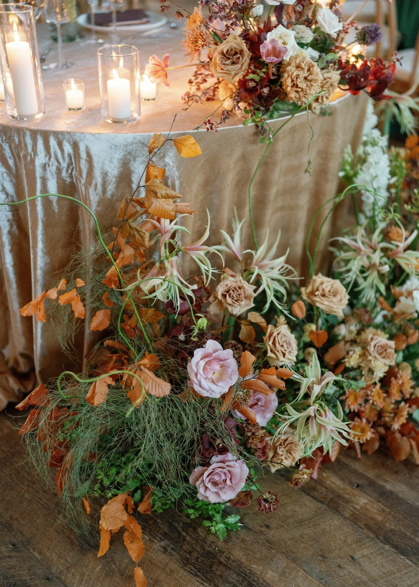
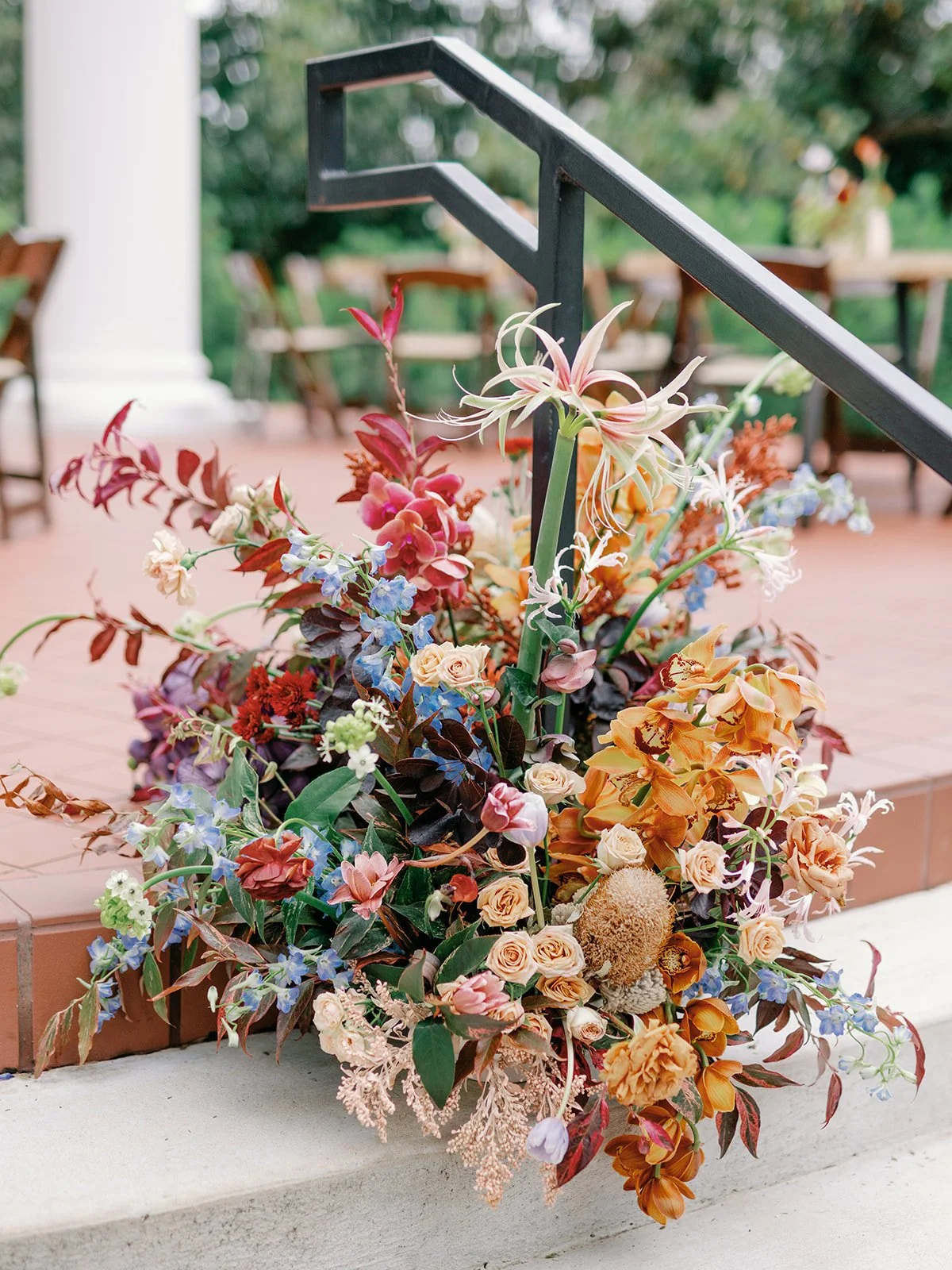
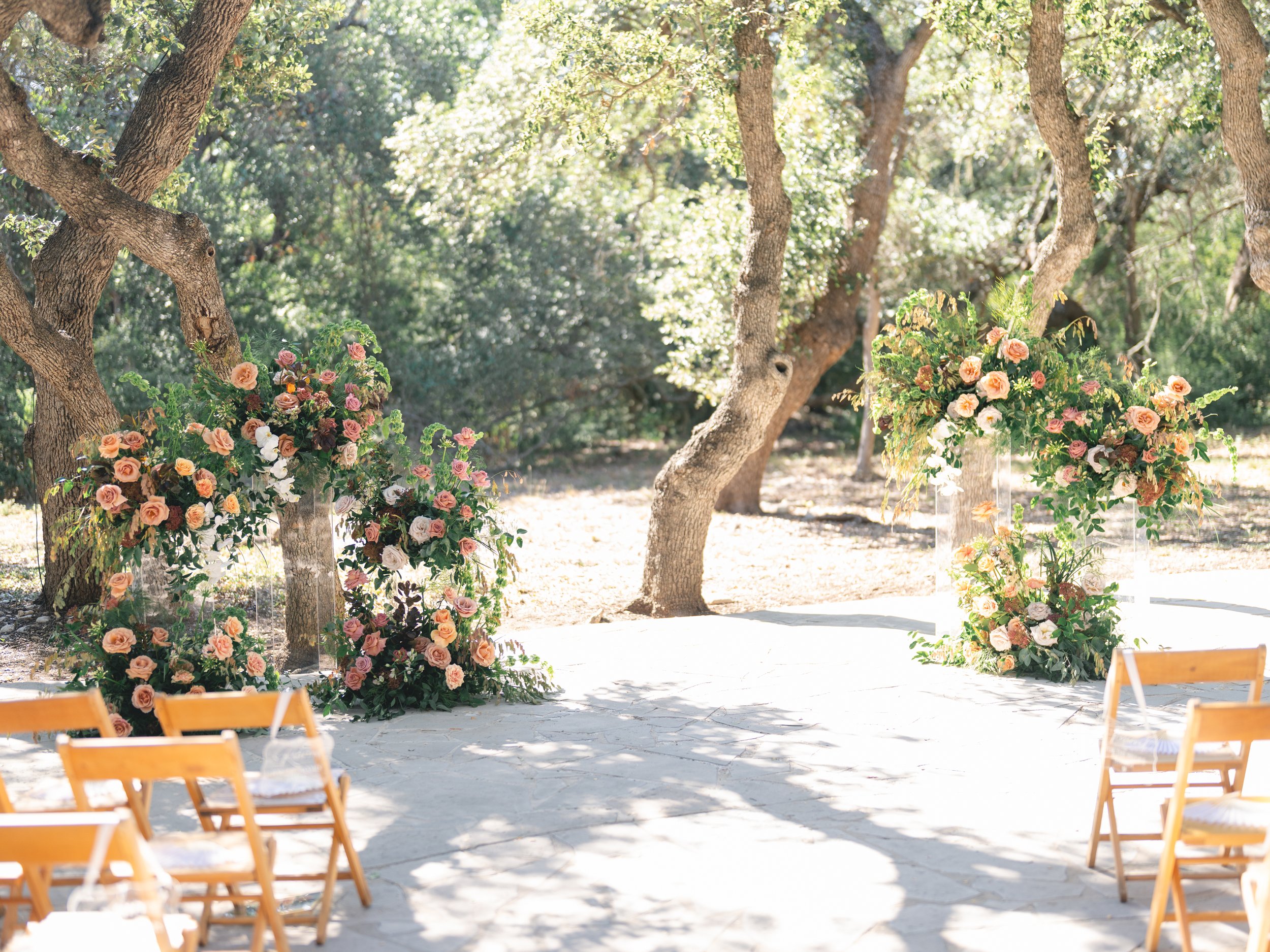
01. Warm + Wild: Amber, Rust, Terracotta, and Deep Peach
This is the palette that comes up the most when brides say "I want fall but I don't want it to feel basic." Warm ambers, burnt oranges, peachy corals, and terracotta tones are incredibly rich and photogenic, and they translate beautifully into florals because so many of the best autumn blooms fall right into this family.
Think: caramel garden roses, mauve tulips, burgundy orchids, delicate cosmos, and branching golden foliage that picks up those warm tones. This palette looks stunning on dark wood farm tables, against exposed brick, in a rustic barn setting, or inside a warmly lit ballroom. It's one of the most versatile fall palettes we design because it can read wild and untamed in a loose garden arrangement, or elevated and editorial when paired with linen and candlelight.
Best for: Rustic venues, historic spaces, warm wood interiors, outdoor ceremonies with a golden hour reception


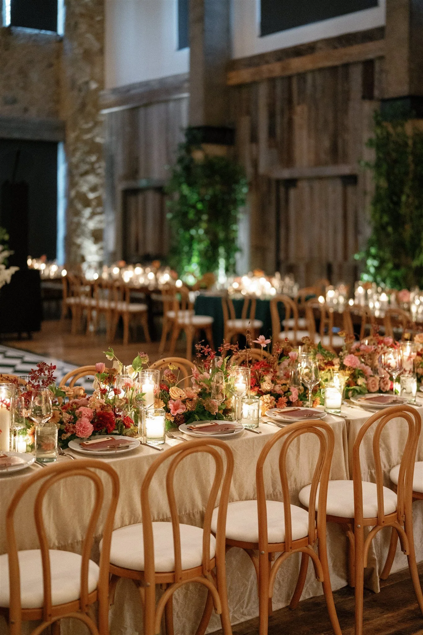
Jeff Brummett Photography - Hotel Drover - Fort Worth, TX
02. Wild + Organic: White, Burgundy, and Sun-Bleached Greenery
There is something about this palette that feels like fall in its most honest form. White cosmos, burgundy dahlias, warm rust, pops of burnt orange, and wild greenery set against the golden grasses and open skies of the Texas Hill Country - it doesn't try to be anything other than exactly what it is. And that's precisely what makes it so beautiful.
This is the palette for the couple who wants their florals to feel like they grew there. Loose, organic, unpretentious, but completely intentional in the way only great design can be. The textural elements are everything here: branching foliage, dried grasses, poppies, and seasonal greenery that gives the arrangements a wild, alive quality that no other season can replicate.
Best for: Outdoor hill country settings, rustic venues, raw and natural spaces, couples who love an editorial yet effortless aesthetic

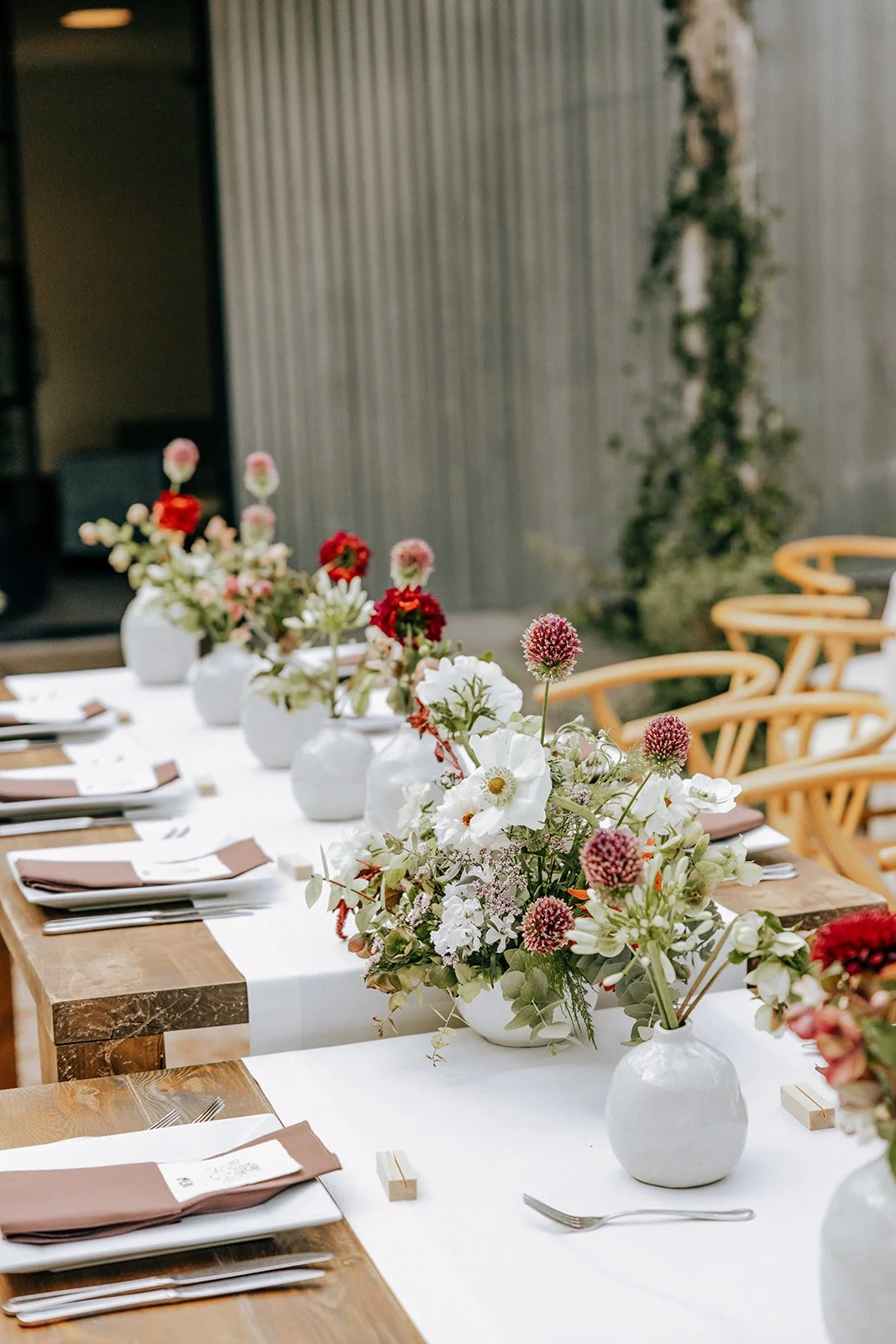

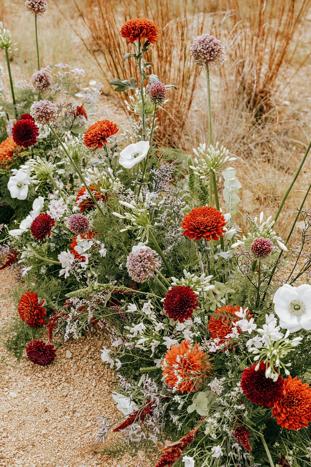
Leah Muse Photography - Cactus Moon - Dripping Springs, TX
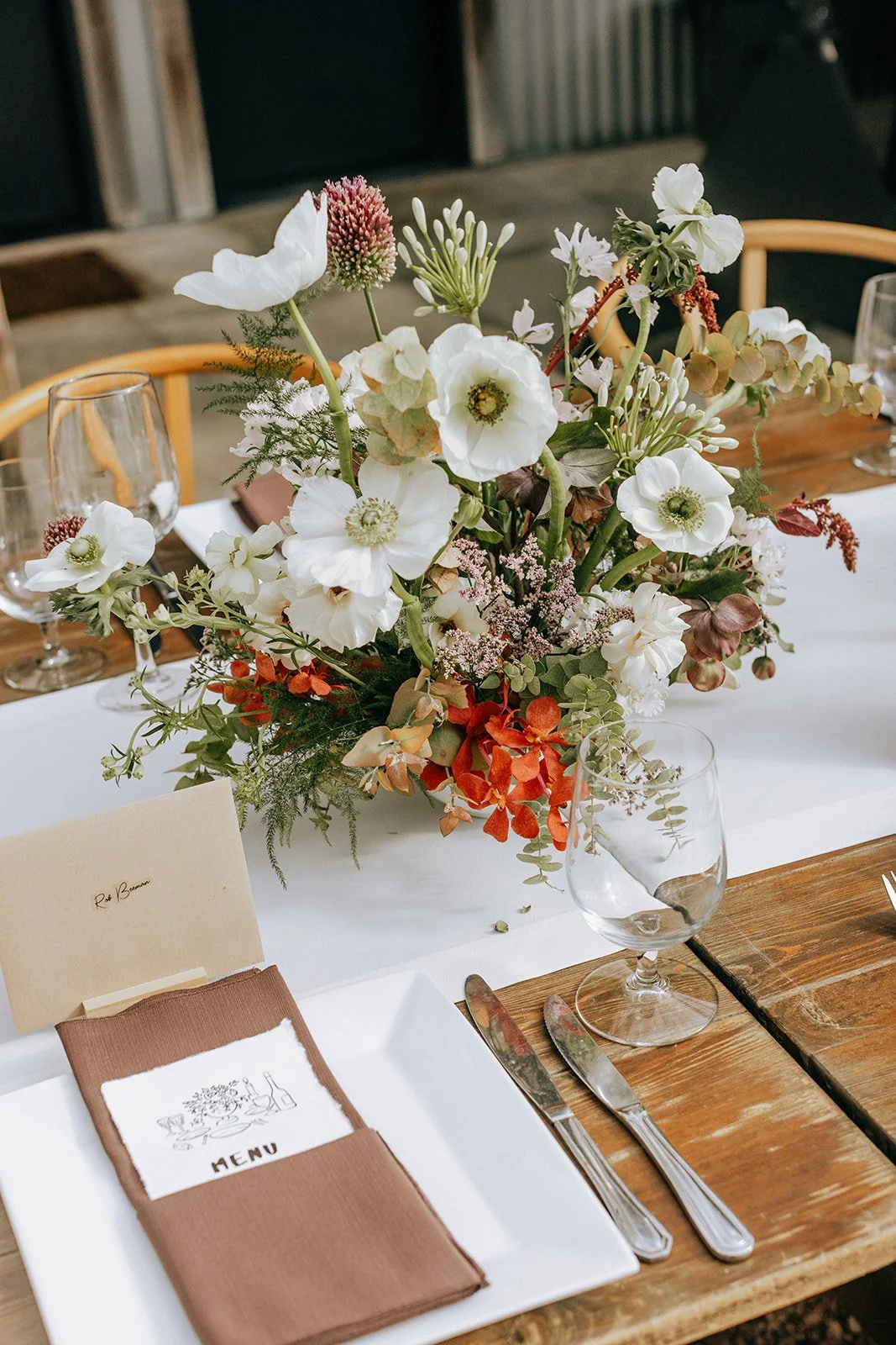
03. Sunlit + Fresh: Lemon, Chartreuse, and Warm White
This is the palette that tends to surprise people the most because it shouldn't feel like fall, and yet it does. Soft lemon, warm chartreuse, and warm white are luminous in a way that photographs unlike anything else, especially under the golden light that fall in Texas does so well. There is a freshness to it that never feels out of season.
The flowers that carry this palette are some of our favorites to work with…white sweet peas, lemon calla lilies, chartreuse viburnum, soft golden butterfly ranunculus, garden roses, and flowering branches that add height and movement. Pair it with butter yellow linens and warm candlelight and the whole room glows.
Best for: Tented receptions, outdoor garden settings, waterfront venues, couples who want something luminous and unexpected


Gracie Byrd Jones Photography - Commodore Perry Estate - Austin, TX
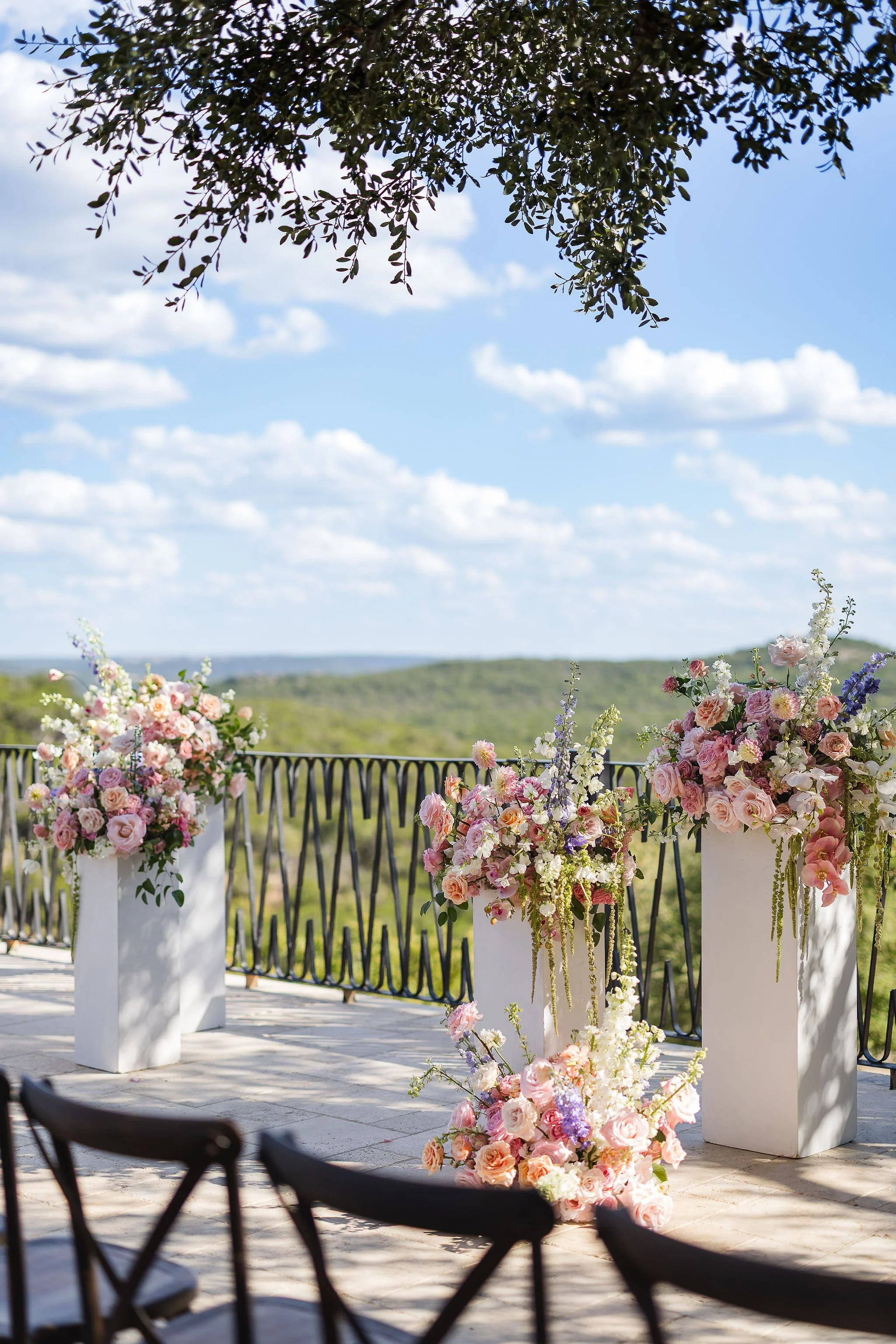
04. Soft + Surprising: Pastels That Still Feel Like Fall
This is the palette for the couple who loves softness but doesn't want to sacrifice sophistication. Dusty blush, warm lavender, soft peach, and antique ivory. In the right setting, with the right light, this is one of the most quietly stunning palettes we design.
Fall pastels have a warmth and earthiness that feels completely at home in the season - more mauve than pink, more antique ivory than white. Soft ranunculus, blush garden roses, dusty lisianthus, creamy dahlias. Pair it with warm candlelight and neutral linens and it reads as quiet luxury, full stop.
Best for: White and neutral venues, outdoor ceremonies, couples who love light and airy photography, daytime fall weddings
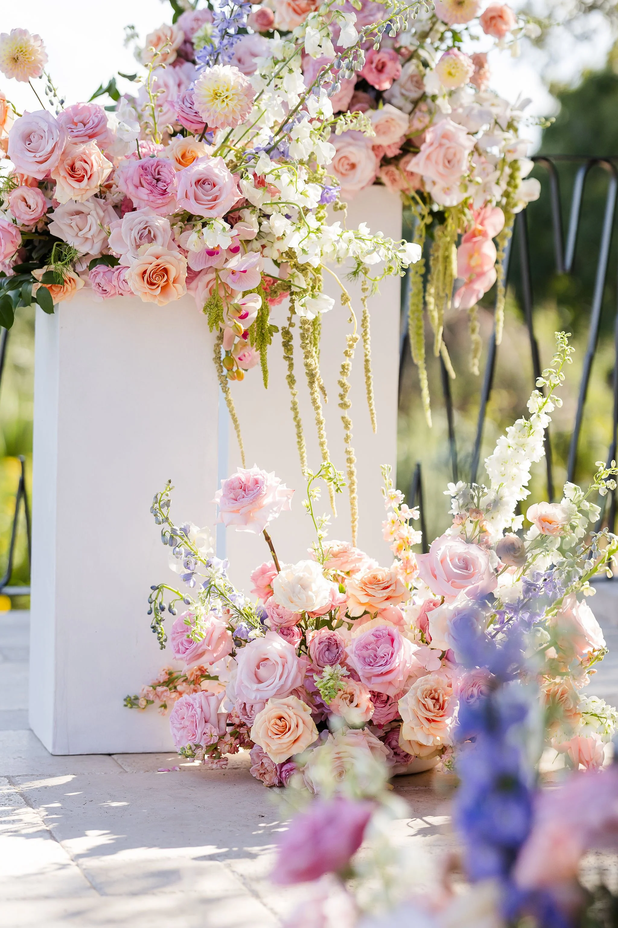


TwoFish Weddings - Villa Antonia - Austin, TX
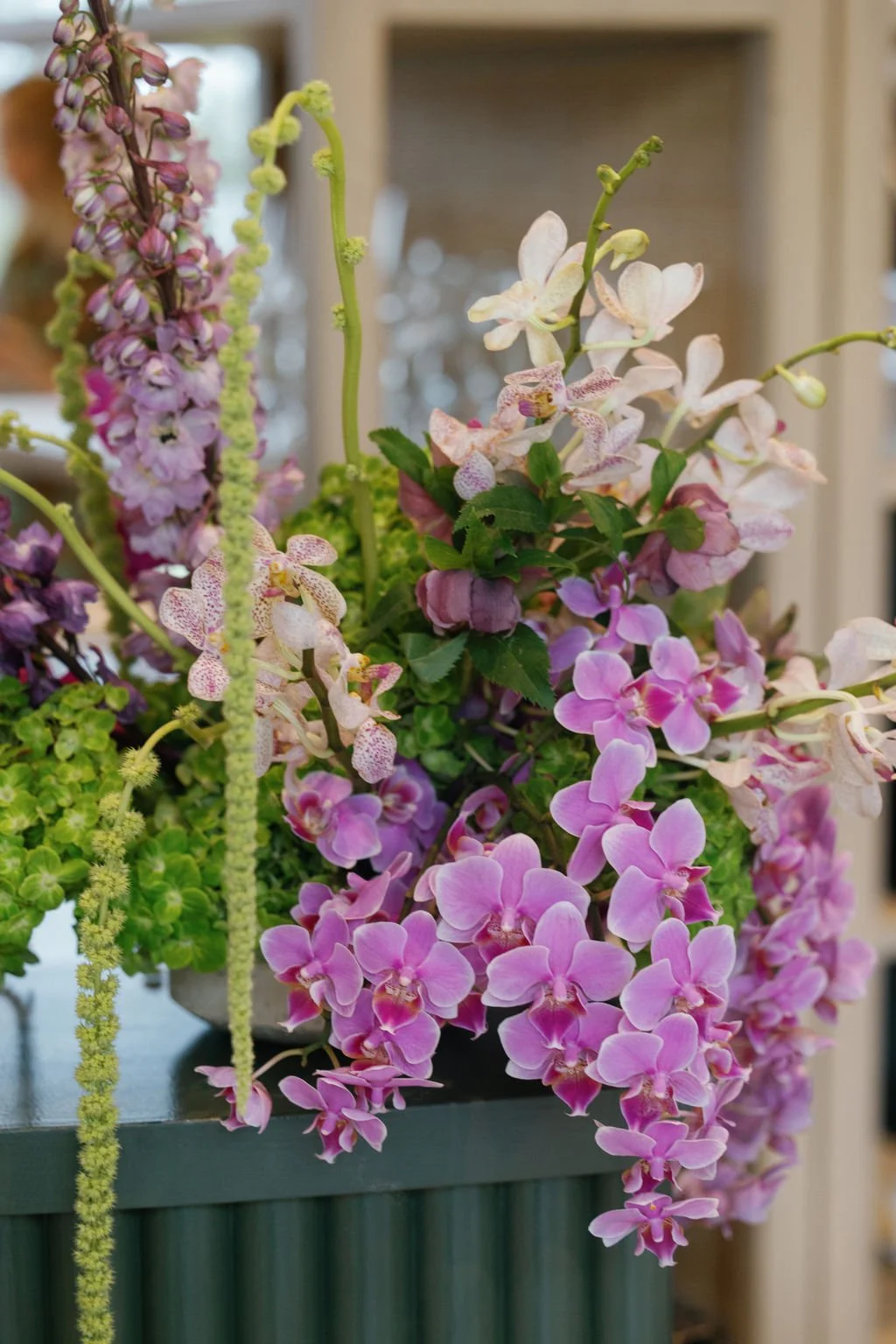
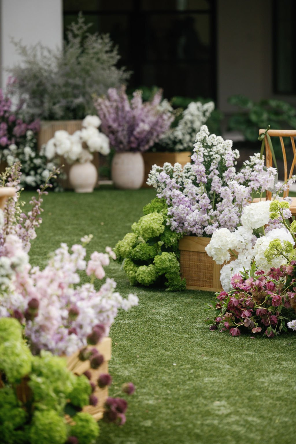
05. Whimsical + Ethereal: Lavender, White, and Dusty Purple
This color story is one most people don't picture when they think fall, and it is one of our absolute favorites to design with! Lavender, dusty purple, soft white, and hints of blush create something that feels almost dreamlike. Delicate but not delicate. Romantic without being predictable.


Aurelia Baca Photography - Hotel Ella - Austin, TX
The flowers that bring this palette to life are some of the most beautiful in the fall lineup - delphinium, allium, white hydrangea, clematis, scabiosa, and fluffy peonies. Together they create a softness and movement that photographs unlike anything else. Against white architecture or lush greenery, this palette completely transforms a space.
Best for: Historic venues, white stucco or column architecture, outdoor ceremonies, garden settings


Abby Jiu Photography - The Arlo - Austin, TX
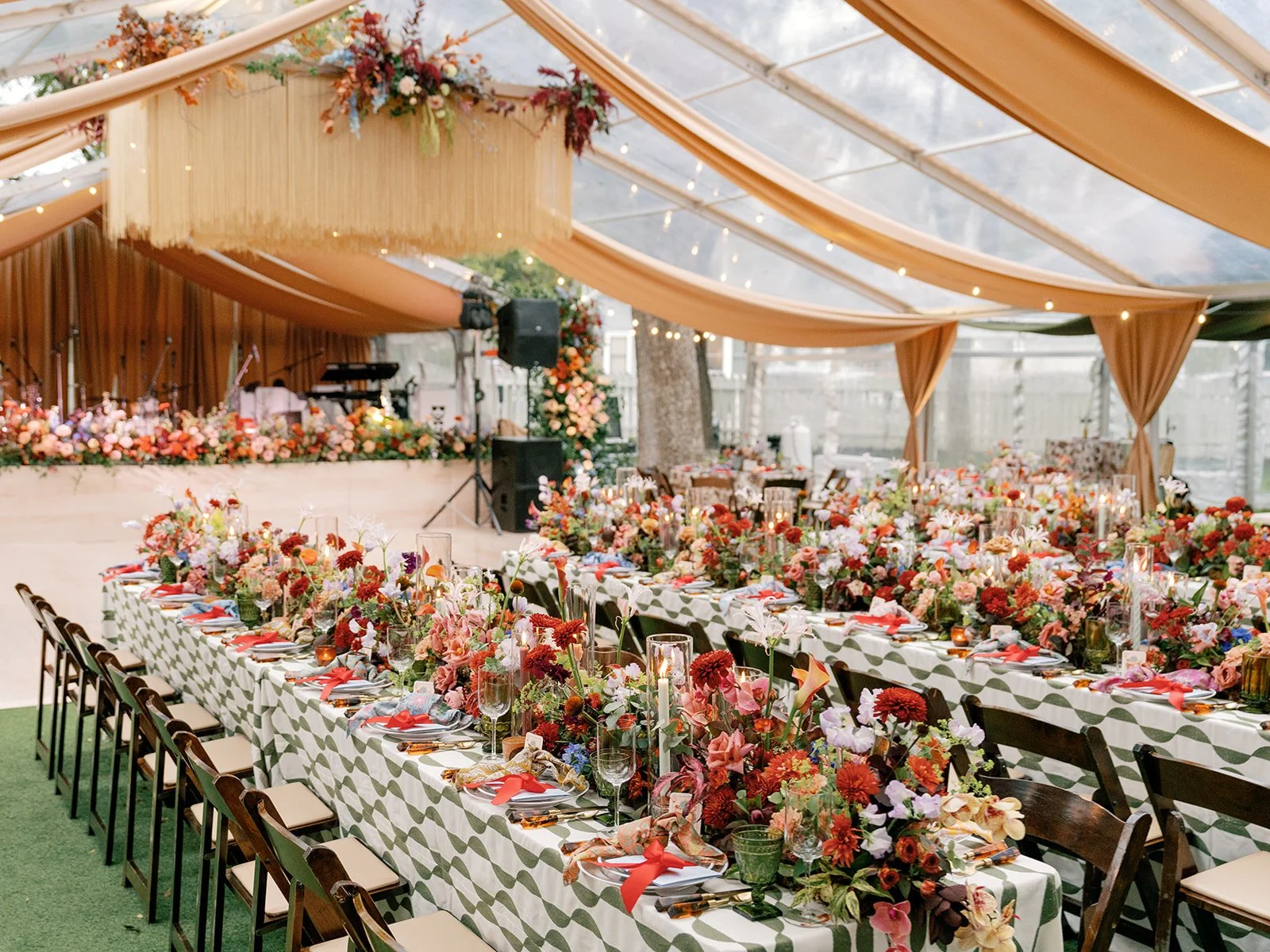
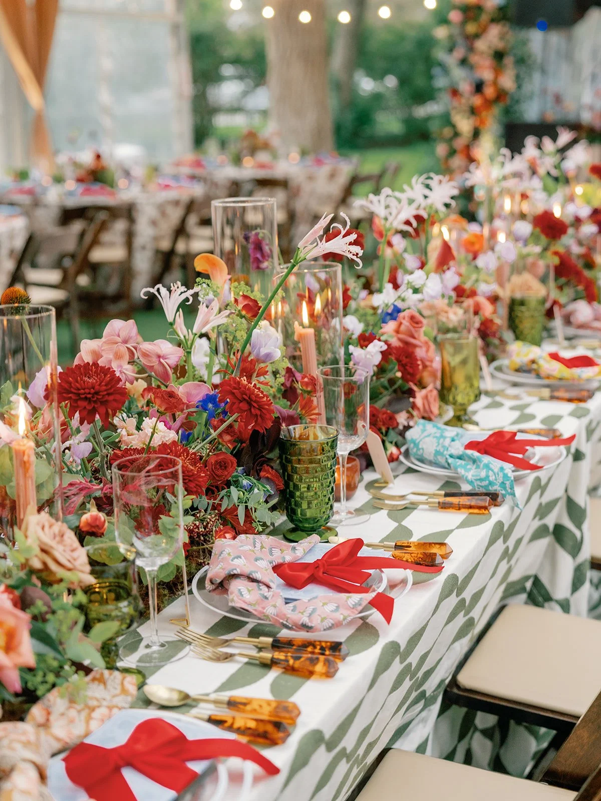
06. Bold + Joyful: Coral, Vivid Orange, Hot Pink, and Deep Green
This is the palette for the couple who wants fall to feel alive. Not moody, not muted - but full of color and movement and joy! Vivid coral, hot pink, burnt orange, peach, and lush green all living together in arrangements that feel like a fall garden at its absolute peak.
The secret to making this palette feel elevated rather than chaotic is lushness - volume, layering, and a strong green base that anchors everything. When it works, it really works.
Best for: Clear tent venues, outdoor garden settings, couples who love maximalist design and bold photography


Ruét Photography - Woodbine Mansion - Round Rock, TX
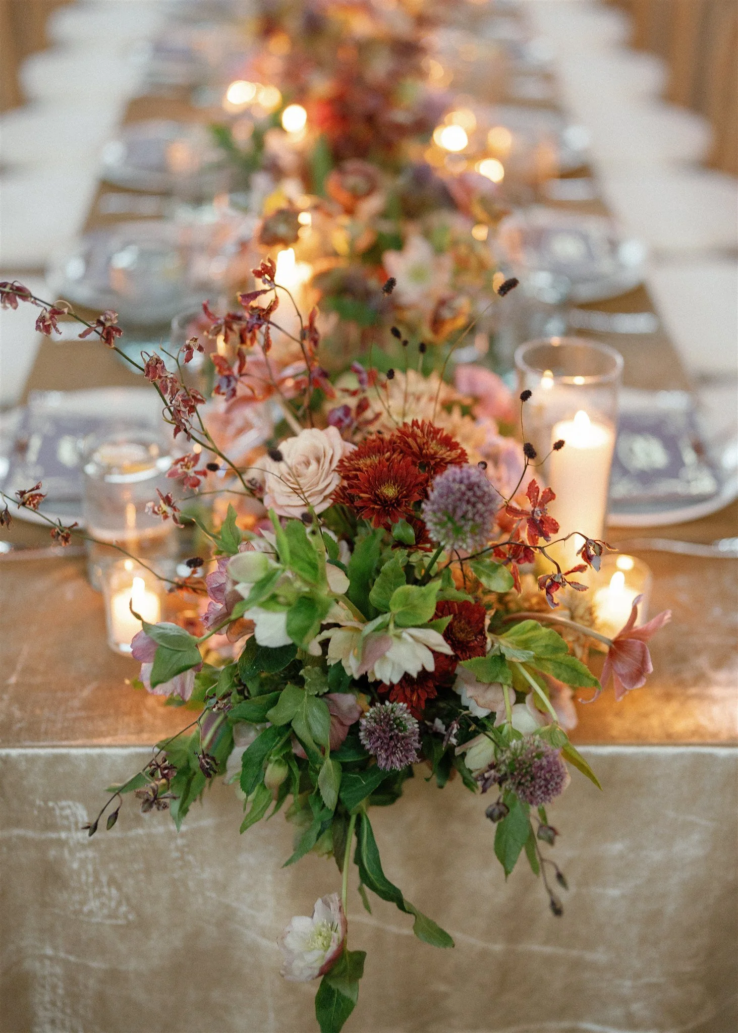
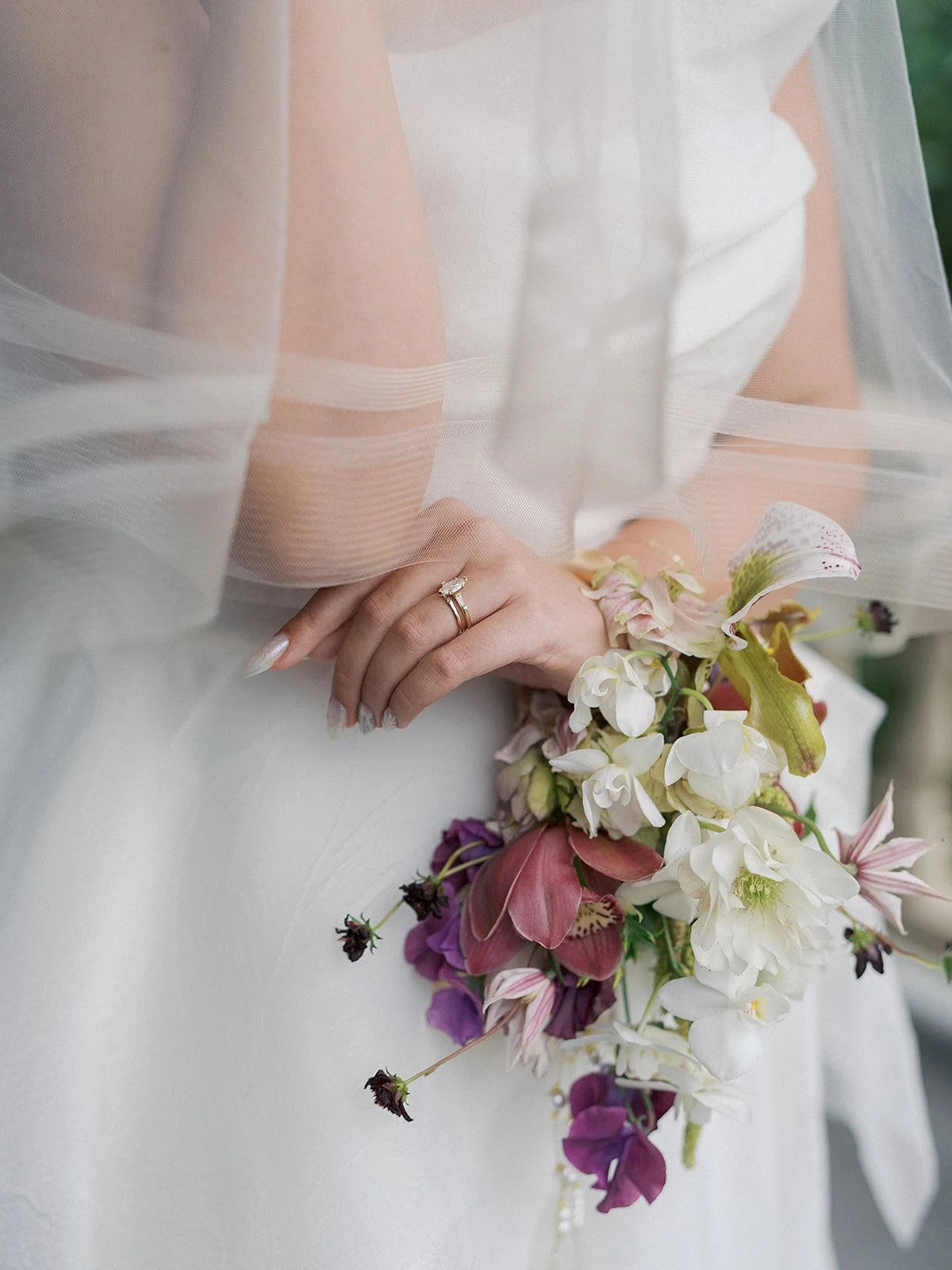
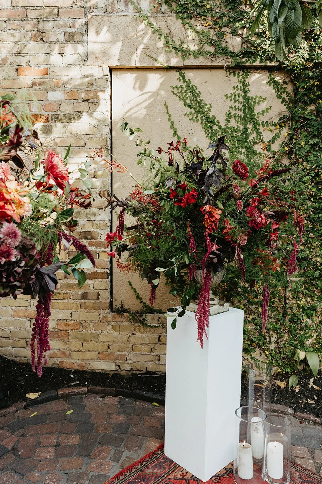
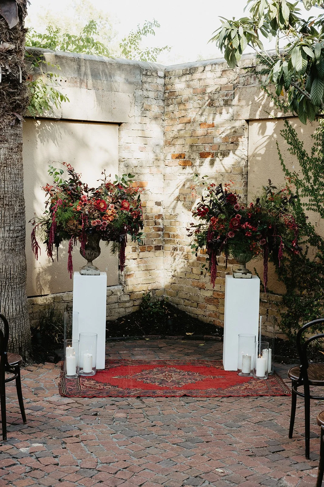
07. Dark + Dramatic: Jewel Tones, Deep Burgundy, and Rich Plum
This is fall at its most atmospheric. Deep jewel tones - oxblood, burgundy, rich plum - paired with cascading amaranthus and dark botanical foliage create arrangements that feel less like flowers and more like sculpture. There is a theatricality to this palette that is entirely intentional.
The key to making jewel tones sing rather than overwhelm is contrast and movement. Cascading elements like amaranthus and hanging foliage add drama without heaviness. Dark foliage grounds the blooms. And against exposed brick or candlelight, this palette becomes something genuinely stunning.
Best for: Historic venues, exposed brick spaces, intimate ceremonies, couples who want something truly moody and romantic

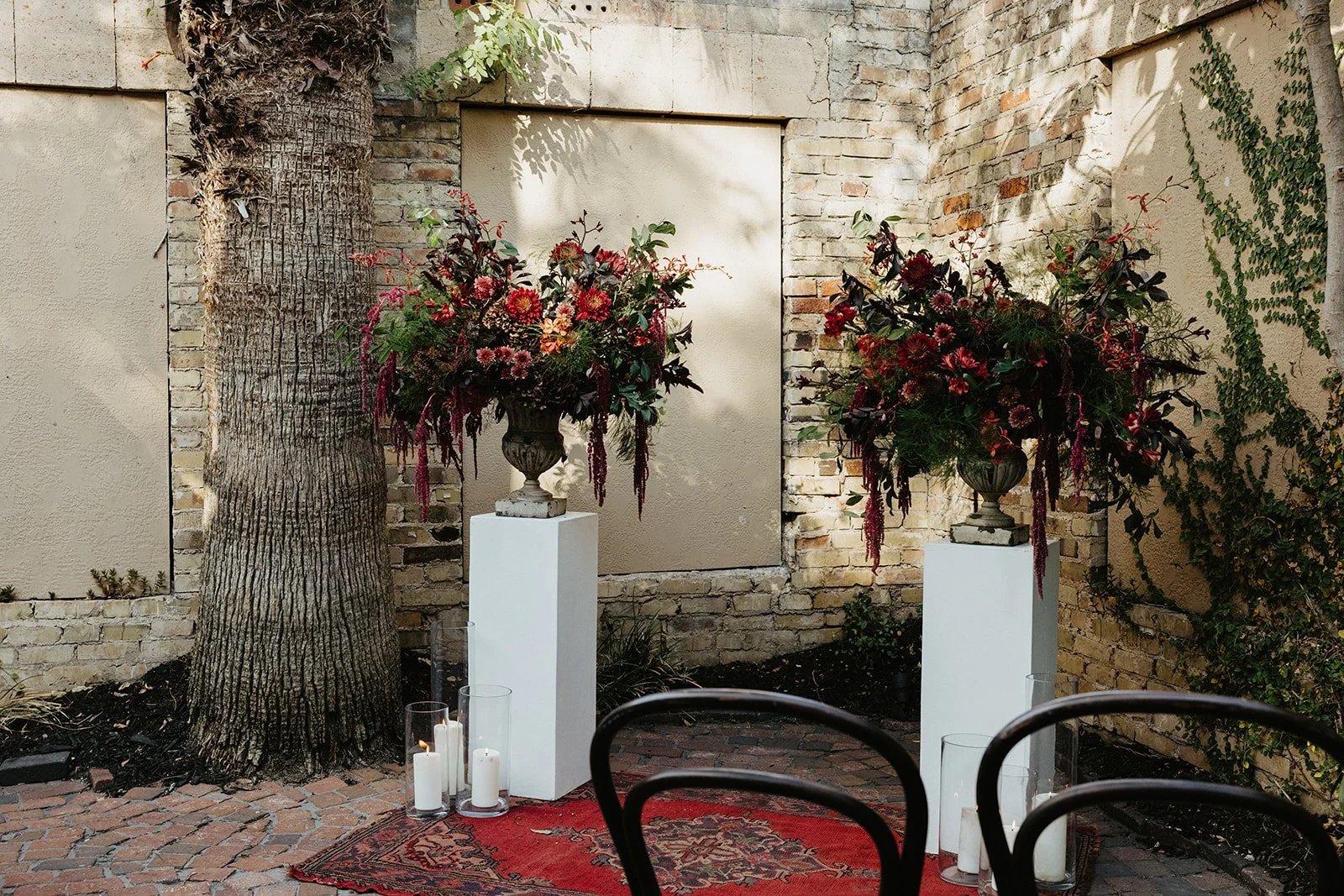
Southern Love Creative - Justine’s Secret House - Austin, TX
What’s Trending on Pinterest Right Now
These are some of the fall inspired pins getting the most love on our Pinterest right now, and honestly, we understand why! There is something about this season that makes people want to go bigger, richer, more saturated with color and life. Rich reds and burgundy dripping with drama. Warm amber and rust that photographs like a dream in golden hour light. Fall has a way of giving brides permission to be bolder than they ever thought they would be, and we love watching that happen.
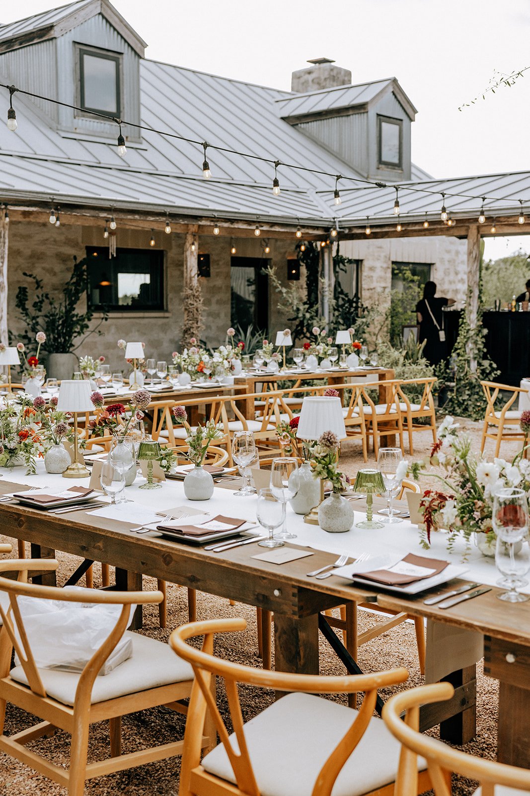
How to Choose Fall Wedding Colors Based on Your Venue
This is where a lot of couples get stuck. They find a palette they love, and then they book a venue that fights it.
Warm wood, exposed brick, and rustic spaces are already doing a lot of work for you. These venues carry warm tones naturally, which means your florals need to either lean into that warmth (amber, rust, terracotta feel right at home) or deliberately contrast it (jewel tones and moody palettes create a striking tension against raw materials). What doesn't work as well in these spaces? Very light, airy pastels - the venue's architecture tends to overwhelm them.
Hotel ballrooms and modern event spaces have the opposite quality. They're often neutral enough to absorb almost anything. This is actually where bold palettes shine most, because the space isn't competing. Jewel tones, deep moody palettes, and even unexpected citrus can all read beautifully in a space where the architecture doesn't have strong opinions.
White and neutral venues are a blank canvas in the best possible way. Without competing tones in the architecture, almost any palette can shine - soft blush and mauve read as deliberate and elevated, bold jewel tones feel dramatic and intentional, and even the most unexpected palettes like citrus or lavender land exactly as designed. These spaces give you the most creative freedom of any venue type.
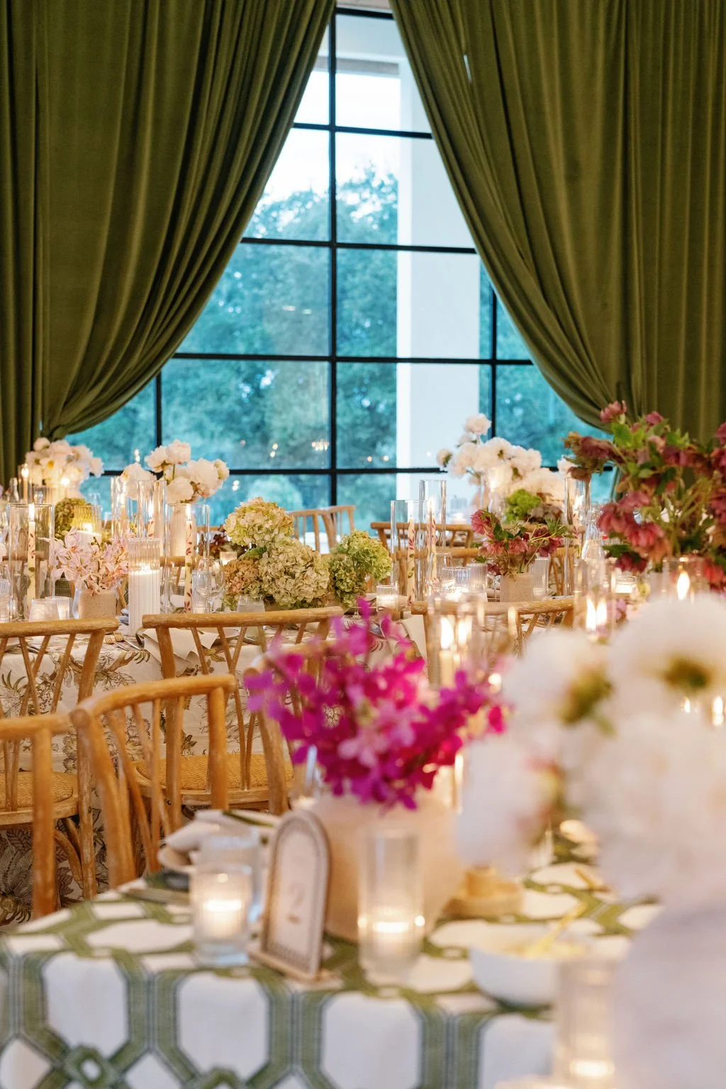
Outdoor ceremonies with indoor receptions offer a rare opportunity: you can use two slightly different expressions of the same palette. We often design the ceremony in something slightly more organic and loose, textural, and garden-inspired. Then, we bring it indoors with a more refined, polished version of the same tones. The palette connects the two spaces while the arrangements feel tailored to their individual settings.
Historic and ornate venues demand something that can hold its own. Delicate pastels can feel lost in spaces with heavy architectural detail. Bold, lush, and layered palettes - whether that's warm and rich or deeply moody - tend to feel most cohesive in venues with a lot of character.
Paige Vaughn Photography - The Addison Grove - Austin, TX
The Way We Think About Fall Color
Every palette we build starts with a color story. What emotion do you want to walk into? What should the room say about the two of you the moment your guests arrive? We pull inspiration images, talk through what color stories speak to you, and from there we start building with the full picture in mind. The florals, the linens, the lighting, the venue itself. Everything has to speak the same language.
With fall specifically, we think a lot about balance between warmth and depth. Fall color theory is rich. There are so many ways to layer tone on tone and create something that feels dimensional and intentional rather than flat. We also consider what's actually in season, because fall blooms have a range and a texture that genuinely can't be replicated at other times of year. That's part of what makes designing for fall so exciting for us.
For a deeper look at how we approach color theory and palette building across all seasons and events, head to our Color Stories post.
Your Fall Color Story Starts Here
There is something about fall that reminds us why we do this work. The dahlias at their peak. The way candlelight hits a room full of deep, rich color. The feeling of walking into a space and knowing instantly that it is exactly right. That is what we design toward, every single time.
Whether you're celebrating in Austin, Richmond, or somewhere wonderfully far from home, we'd love to help you find that feeling. Reach out and let's start designing your color story.
About Remi + Gold
Remi + Gold is a luxury floral atelier based in Austin, TX and Richmond, VA. We travel anywhere love takes us. We believe that floral art is meant to move people, and weddings are where that belief comes to life most fully. Every color story we build, every arrangement we design, every bloom we place is done with intention - for you, for your guests, for the memory of walking into a room and feeling something you didn't expect to feel. We are so lucky that this craft found us, and even luckier to share it with couples who trust us with one of the most meaningful days of their lives. If you are planning a wedding near or far, we would love to be part of your story.