Color Stories: Creating Cohesive Palettes with Flowers
At Remi & Gold, we believe color tells a story - and florals are one of the most powerful tools in setting the tone for your event. Whether it’s a soft, romantic wedding in Austin, a bold corporate dinner in Scottsdale, or an intimate destination celebration in Telluride, your color palette anchors the entire experience.
We use flowers not just to decorate a space - but to create emotion, elevate a vibe, and bring your vision to life in a way that feels elevated, cohesive, and completely you.

Ruét Photography
What Do We Mean by “Color Story”?
To us, a color story is using color intentionally - through flowers - to invoke a specific emotion or feeling. Soft pastels may feel dreamy and romantic, while jewel tones may feel more bold and dynamic. Color impacts everything: the vibe, the photos, the way guests experience the space.
It’s never just about pretty colors - it’s about crafting a palette that supports the overall design direction and feels good the moment you walk into the room.


ruét photography
How We Build a Floral Color Palette
About 95% of our couples come to the table with a color palette already in mind. Most clients have a clear vision and are excited to collaborate with us - and their planner - to fine-tune the final design.
We usually start by pulling inspiration images and talking through what color stories speak to them. From there, we make recommendations based on what florals are in season (since some varieties only come in certain shades) and how the color palette ties into the full event design - like linens, lighting, and signage.
We always consider balance, seasonality, and the emotion each color brings to the space. The end result should feel cohesive, intentional, and totally aligned with your overall vision.
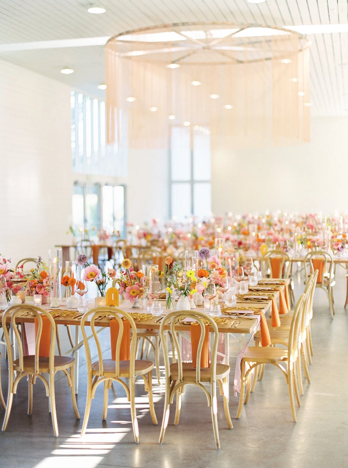
Tips for Combining Unexpected Colors (and Still Making Them Look Elevated)
Creating a floral palette with unexpected color pairings doesn't have to feel risky. Here’s how we keep things feeling high-end, intentional, and totally design-forward:
1. Balance Bold Colors with Grounding Neutrals
A bold color works best when it has something grounding to play against. Pairing something rich like terracotta with an earthy olive green creates a palette that feels intentional, not overwhelming. It’s all about contrast with control.
2. Let the Bold Live Beyond the Blooms
If you love a bold hue (hi, teal!), but worry it might overpower the floral design, consider using it outside the blooms. Try it in your napkins, lounge rentals, signage, or linens. That way, the flowers can remain soft, complimentary and textural while still tying into your color story.
3. Keep Texture (or Shape) Consistent
Even when using a mix of colors, keeping florals within the same texture family - like all velvety blooms - can create cohesion and balance. Alternatively, focus on shape. A consistent, organic structure across your arrangements adds harmony, even if the colors vary.


Sarah tribett photography
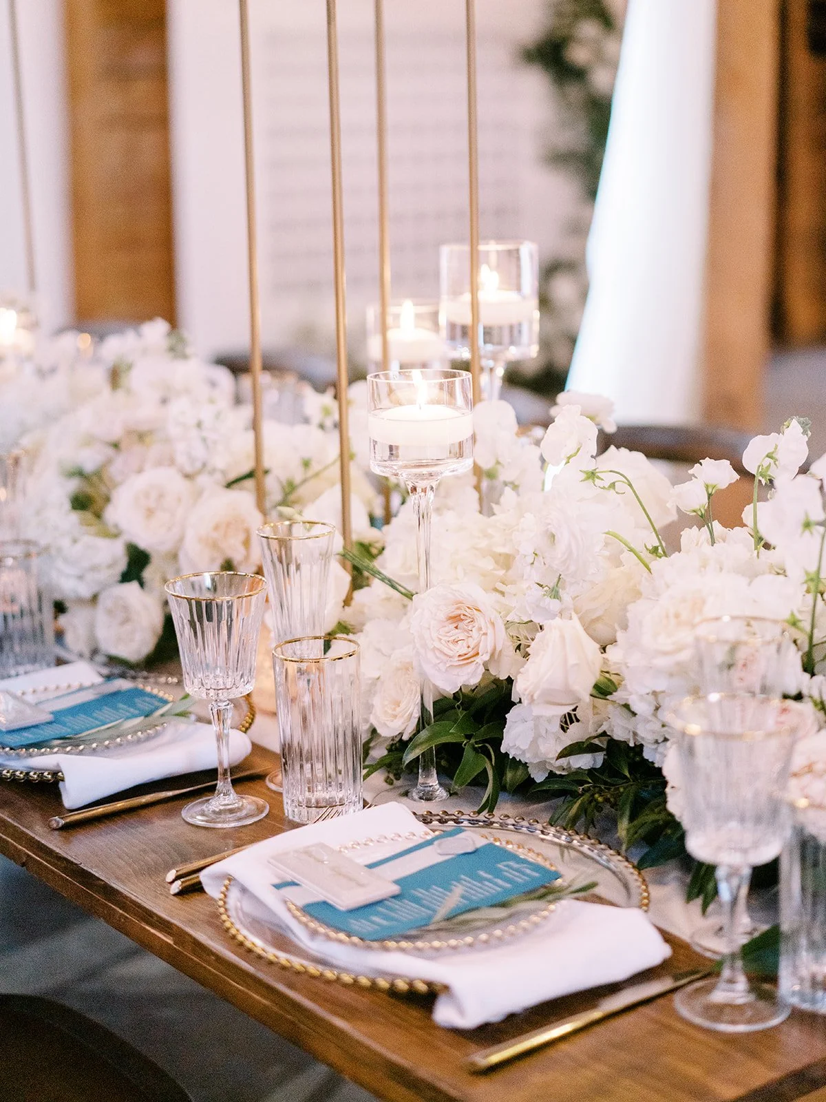
Use Greenery + Neutrals to Let Color Shine
Greenery and neutrals aren’t just fillers - they’re design tools. When clients love greenery, we often use it as the base of the design and build the floral palette on top. This approach creates a three-dimensional look that feels layered and elevated. A deep green base, in particular, helps the bolder floral tones pop and adds rich contrast throughout the arrangement.

Ruét Photography
A Favorite Palette We Keep Coming Back To
One of our favorite color palettes lately has been soft pastels paired with deep greens. Most pastel tones naturally invoke a sense of peace, and when you layer in contrasting hues - like pink and green - they don’t clash. Instead, they complement one another beautifully.
There’s something about that subtle contrast that feels elevated and serene, especially when paired with lush greenery or natural textures. It’s a timeless combo that works across seasons and styles.


Ruét Photography
If You’re Nervous About Going Bold…
When a client loves a bold color but worries it might be too much, we suggest what they might already suspect - either find a correlating color that balances the design so it can be incorporated thoughtfully, or leave that bold color out of the florals altogether.
Instead, we might use it sparingly in other areas of the event design, like a lounge rental, napkin detail, or table linens. This keeps the floral palette cohesive and elevated, while still honoring their favorite hue in a way that feels intentional.


brittany jean photography
Designing with the 2025 Pantone Color of the Year: Mocha Mousse

Every year, Pantone releases a Color of the Year - and 2025’s pick is Mocha Mousse.
Warm, cozy, and a little unexpected, Mocha is right at home in our world of florals.
We usually encourage clients to take the vintage style and incorporate other colors like pinks, purple, rust, sage, cream, and orange depending on the time of year and theme of their event.
In floral design, Mocha can easily lean mauve or rust depending on the variety. Some of our favorite Mocha-toned blooms include:
Chocolate cosmos
Dahlias
Lisianthus
Roses
Carnations
Cymbidiums
Irises
Orchids
We’re currently incorporating Mocha into a few upcoming events - and can’t wait to share!
Real Wedding Spotlight: Autumn + Spencer at Hotel Drover
This couple had a western-themed wedding with a vintage floral color palette that blended beautifully with the mix of light cream and dark green linens. This combination allowed for a stunning contrast of similar tones and added depth to the entire event.
The floral tones really helped the event lean into the western theme, especially with the darker and more neutral palette. If the palette had included pastels or bright tones, it would have completely changed the design of the event and wouldn’t have made as much sense with their western cowboy theme.


Jeff Brummett Photography
Another example of how florals and color palettes can shape the overall vibe - Autumn and Spencer chose white and greenery only for their ceremony. That choice created a look that felt more classic and timeless, offering a beautiful contrast to the richer tones used in their reception space.


Jeff Brummett Photography
We’ve designed in just about every color combo imaginable, and what we love most is helping couples tell their story. Your palette shapes everything: the mood, the design choices, the florals, and the way your guests experience the space.

Whether you're planning a luxury wedding in Austin, a corporate celebration in Scottsdale, or a mountaintop event in Telluride, we’re here to help you design florals that are as intentional as they are beautiful.
Let’s create something unforgettable - one bloom, one story, one palette at a time.
Ready to bring your color story to life?
Contact our team to get started ↓